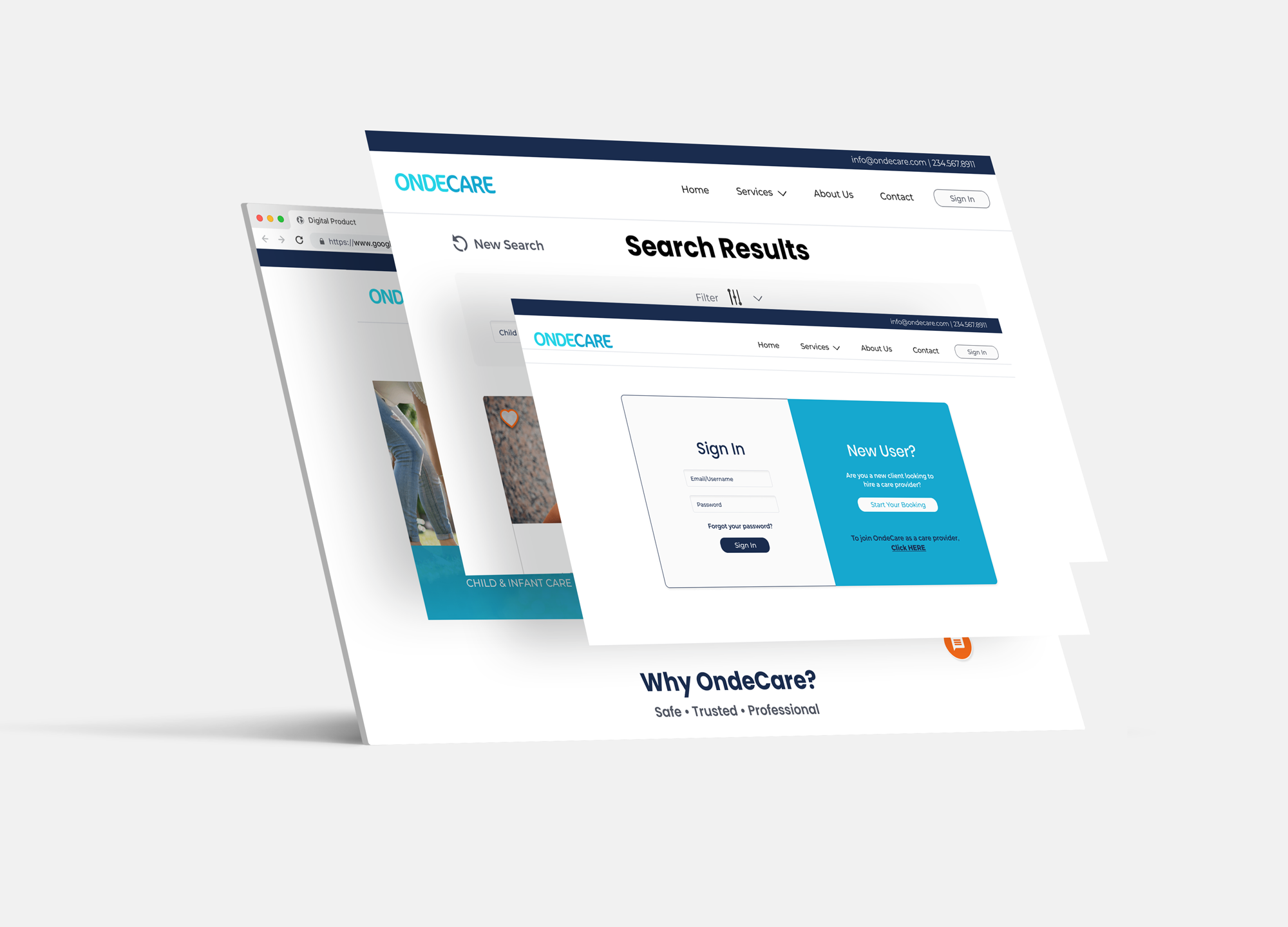
ONDECARE WEBSITE REDESIGN
MY ROLE
User Researcher
Product Designer
Prototyping
Ondecare is a trusted and reliable health care service that provides short-term or part-time care for not only children but infants, elders and people with special needs.
Clients use OndeCare's website to search through a variety of care providers who have all been thoroughly vetted through OndeCare’s secure screening process. Once clients choose a provider, they can reserve them, then pay online, and their OndeCare Provider shows up at their door.
My team received the opportunity to work with Nicole the owner of OndeCare, to come up with the next phase of her existing MVP website.
THE PROBLEM
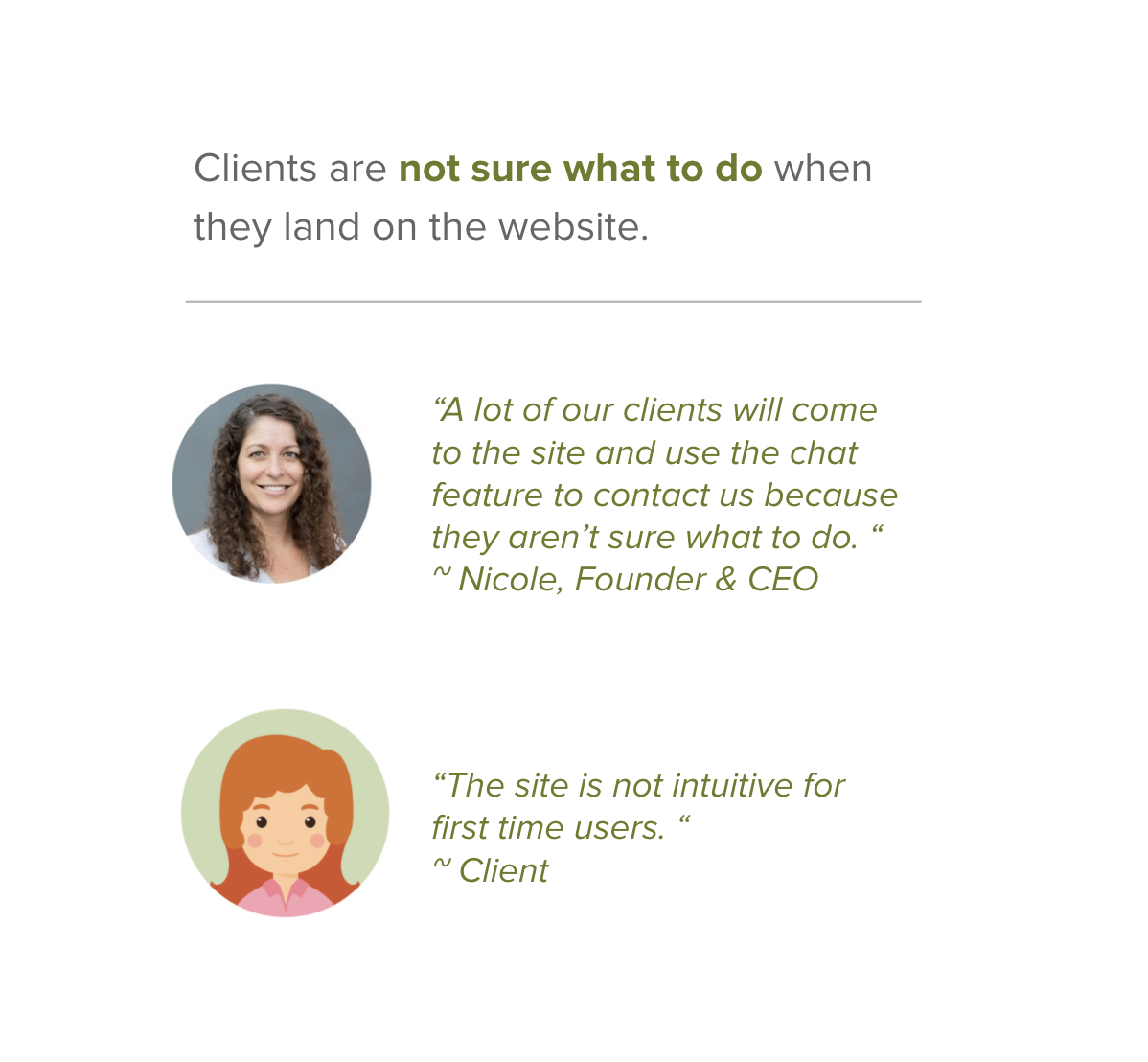
Users are confused when they land on the website. The homepage is cluttered with information and large unresponsive images. There was a need to improve the OndeCare user interface and decrease confusion while users book care providers.
OBJECTIVE
To redesign the home page that clearly highlights that OndeCare is the solution for reducing stress and providing an affordable solution for child & health care services.
USER RESEARCH
RESEARCH METHODS
Competitive Analysis | OndeCare Provider Interviews | Client Interviews | Usability Testing
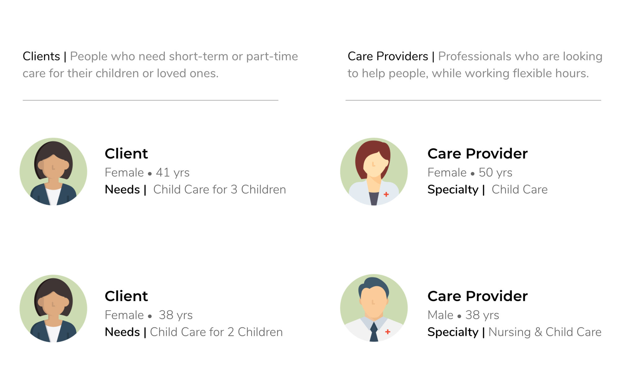
In order to gain a deeper understanding, we conducted several methods of research to gather insights and identify pain points for website users. We conducted phone interviews with 2 care providers and 2 clients, as we thought it would be best to speak to people who use Ondecare's service often.
We wanted to know what the booking process was like for a client and a care provider, and what struggles they were faced with during the process.
KEY QUESTIONS
What causes confusion in the search process?
How is the site used for clients vs. care providers?
Where does the account creation/login process fit in?
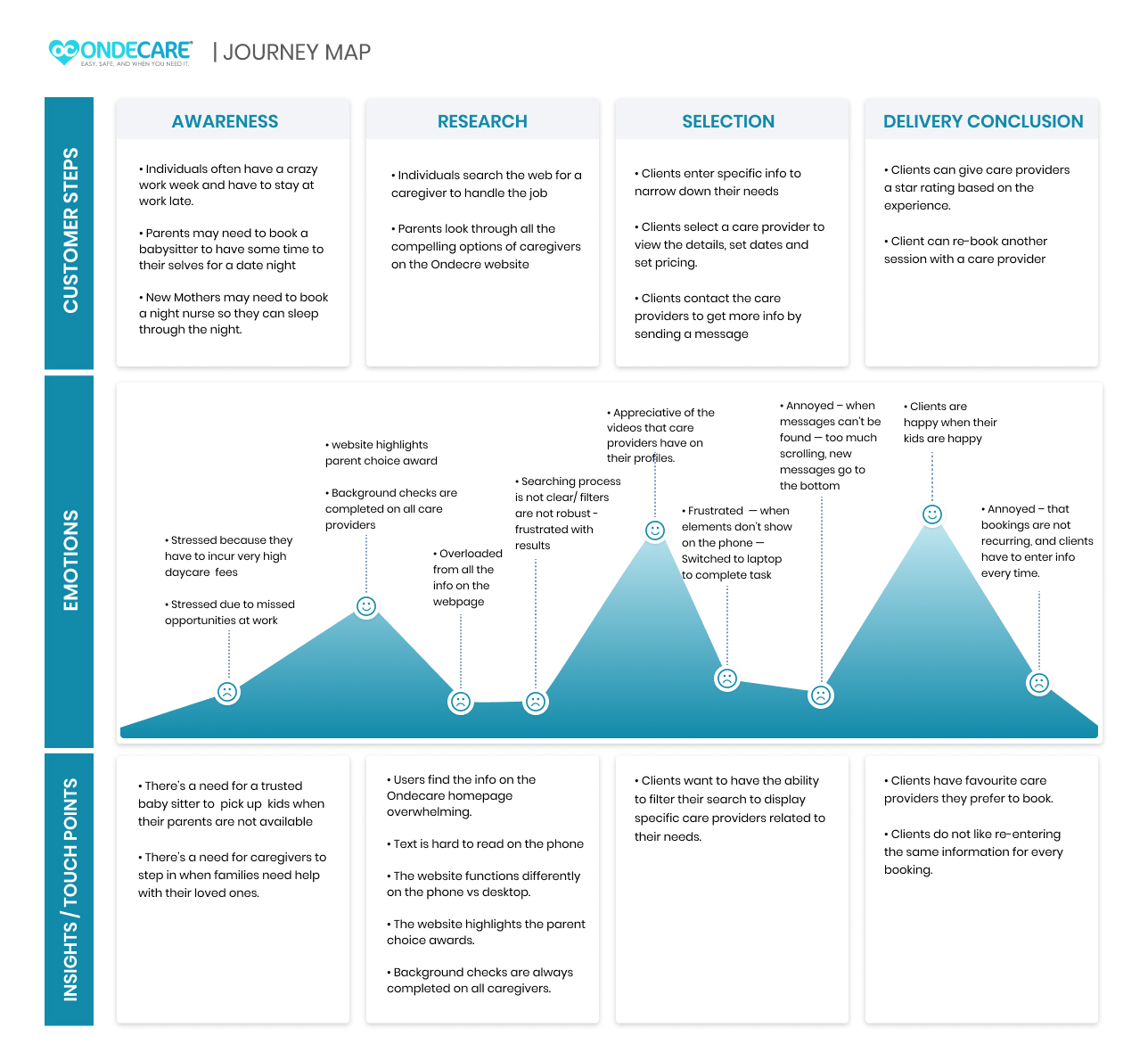
IDEATION
MOCKUP SKETCHES
Base on what we discovered from our research. Our goal was to include key elements in our sketches that were crucial in the users' Journey. Like:
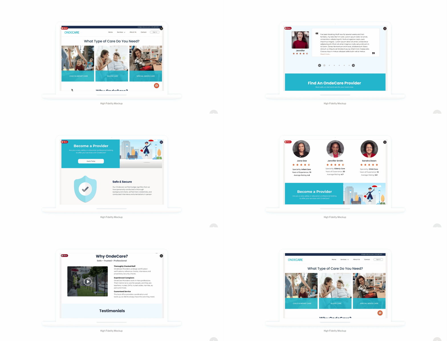
• Focusing on showing the What We Do & Why Choose Us elements — above the fold. So users see the most important content when they land on the site.
• Why choose Ondecare video – to provide an overview of the business in a nutshell.
• How the business works.
• Testimonials from clients – to showcase positive experiences.

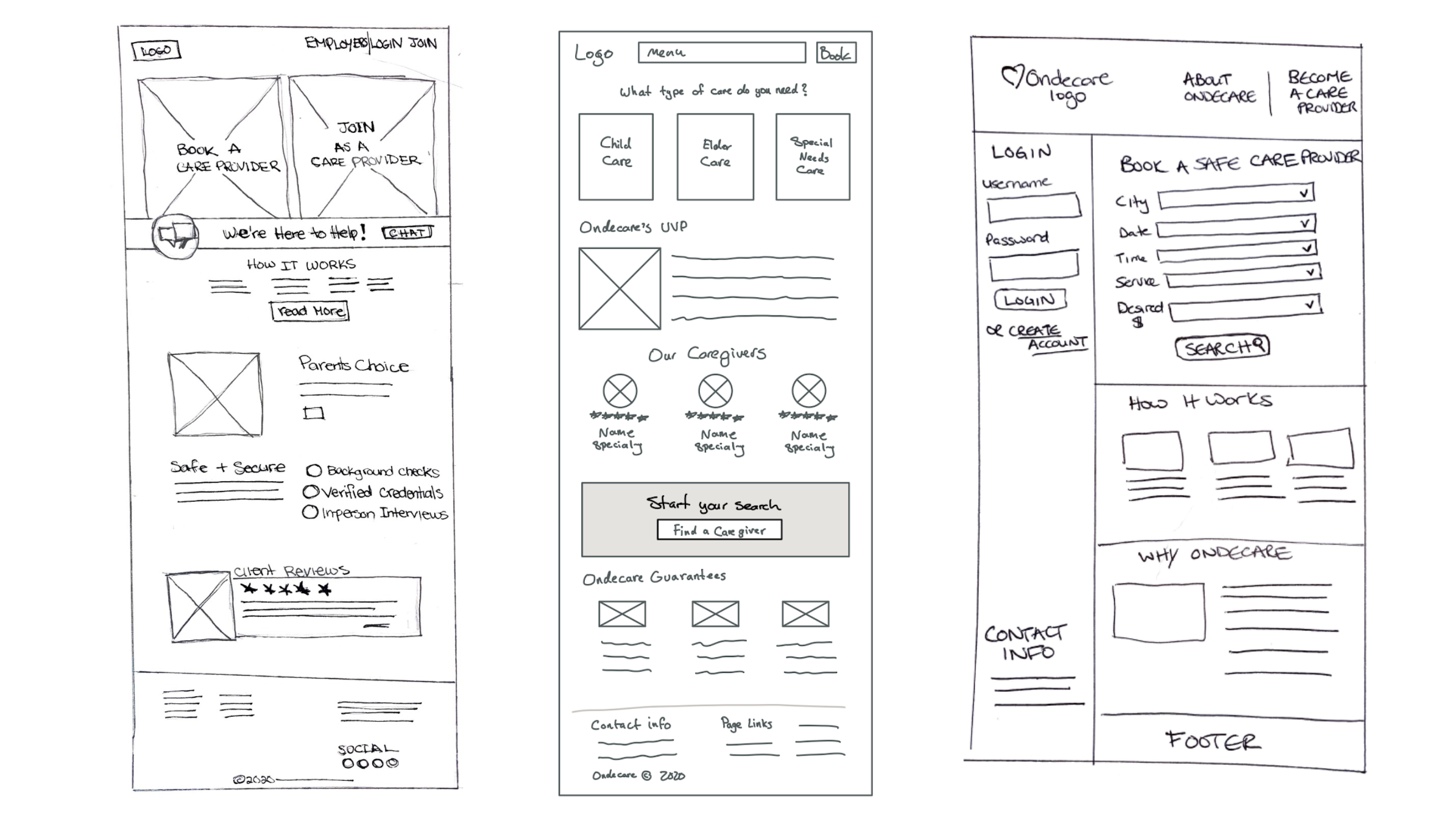
We chose to move forward with the middle sketch because it addressed the major client segments of the business at the top of the page, with a clear Call to Action.
